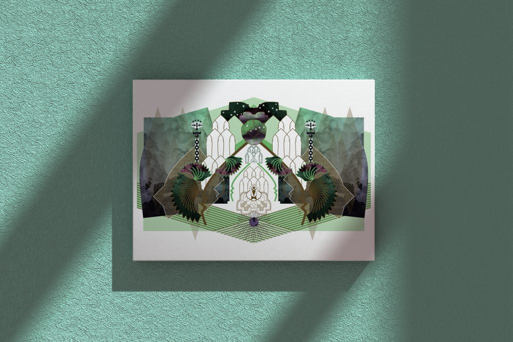
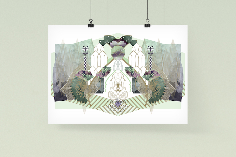
Recently I began incorporating more nature photography to my work in addition to vector lines, as a manner of adding texture and color. As I added to this particular piece, I experimented with getting the contrast right between the foreground and the background. Working with such new elements, I found there were accents that I wanted to be more visible, and overall the piece was feeling a little flat.

A common approach in information design requires us to bring increased order to an uncut inventory of information, not by throwing out information, but rather by fixing the design. In the field of art, a similar strategy is useful. Even so, it can be difficult to discern the role of each element when it comes to artistic compositions. The information analogy can help. Each layer in an artwork has its purpose as far as the information it provides to the overall composition (e.g. background, foreground, accent, focal point, texture, etc). This perspective helps the artist differentiate between when it is appropriate to rearrange existing elements in order to improve composition, and when improving composition is a matter of removing things, simplifying, clarifying.
With that in mind, following the initial inspiration phase, I deconstructed the piece, layer by layer to arrive at a transformed version, and was actually able to include more detail and information while maintaining the clarity of the elements.

Sometimes it is not evident to determine the components of a piece after one session—not without decomposing and analyzing it after putting it aside for a time. This shows that even in artworking, a clinical precision contributes much to the process, and that creativity is always part analysis, acting in concert with those initial bursts of inspiration.
If you want to donate to support my work, you can send me crypto.
Wallet addresses are:
- BTC (Bitcoin): 1A6khgP4sKvbTS7VVVbpAY6A2ze7JEPts4
- ETH (Etherium): 0xC1767A7Cd13Bc7e0914527F58E99b712cEc6Df75

